A common gotcha with aspect ratios
Letterbox scale or Letterbox integer scale are easy ways to get your game to work on a wide range of screen sizes without having to do much work. However, the disadvantage is that black bars appear. This can be annoying for mobile users who have a small screen already, and don't want their display size to be any smaller than necessary.
Additionally the browser address bar - or even the system status bar - can take up a bit of room on a mobile display. This changes the size of the available display area, which can even cause games that have matched the aspect ratio of the display to show some black bars down the sides.
 Letterbox scaling on mobile
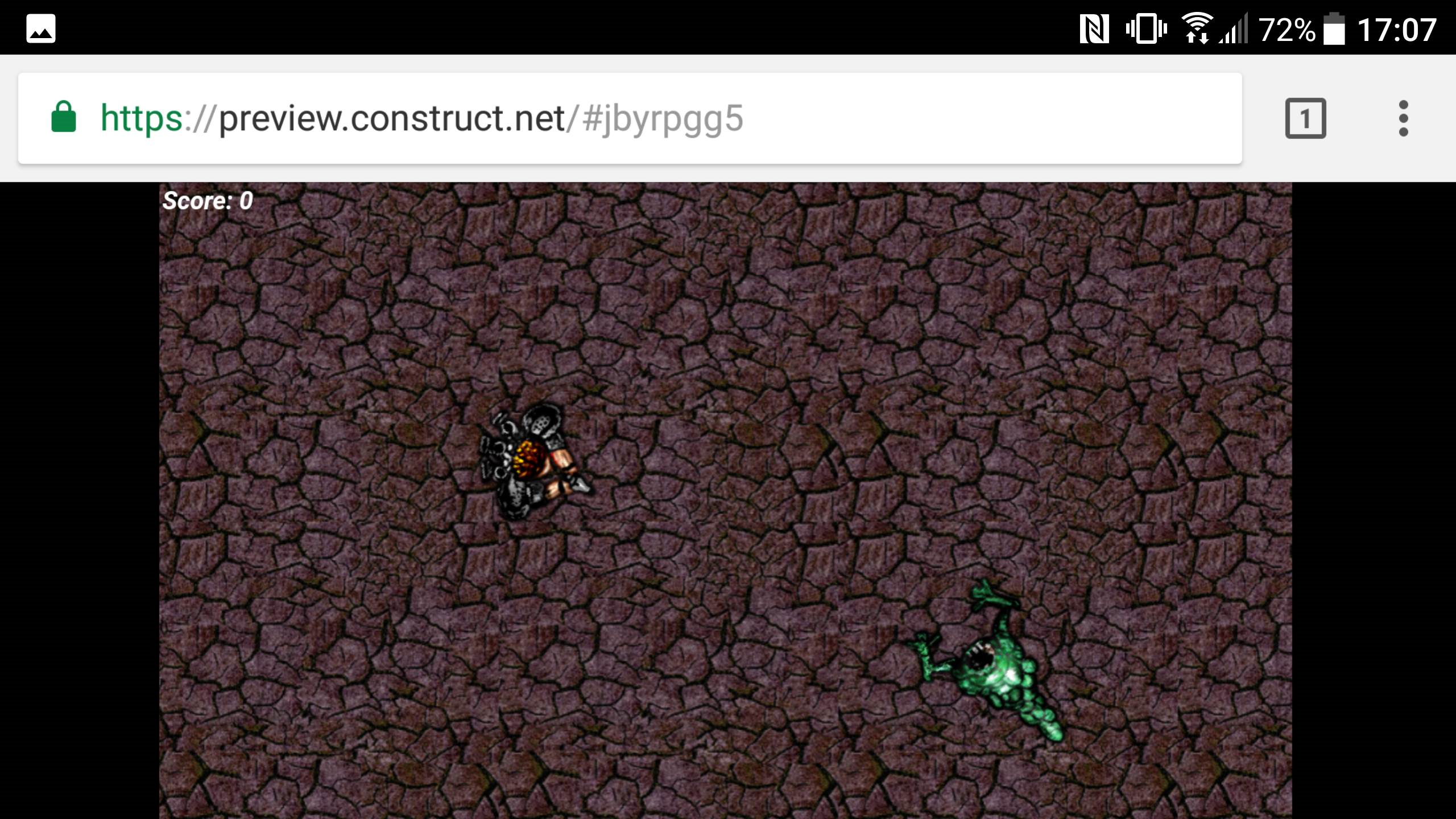
The above image shows a game running on Android which matches the device's 16:9 display resolution, but because the address bar takes up some space, black bars still appear down the sides. The user might wonder "why doesn't the game extend to fill up the space?"
One solution is to use the Browser object's Request fullscreen action. This lets the game scale up to use the entire display.
Sometimes even when using the entire display, the system status bar takes up some space and still causes a similar problem. This can even happen when publishing native apps. To fix this you need to use Scale outer or Scale inner fullscreen mode instead of Letterbox scale. This then means you need to support multiple aspect ratios as well.
This is the same problem faced by TV producers. There are many TVs out there using aspect ratios of 4:3, 16:9 and 16:10. If a producer films a TV show only in 4:3, on a 16:9 TV there will be gaps at the sides, or possibly even unintended off-set equipment and crew visible! Similarly, if you draw a background exactly fitting one display, then run it with Scale outer fullscreen mode on another display with a slightly different aspect ratio, gaps will appear at the side or content outside the layout becomes visible.
There are two ways to solve this problem:
- Use Scale inner mode, and make sure nothing important is close to the edges, since the edges are susceptible to being cut off on different size displays.
- Use Scale outer mode, and draw your backgrounds wider (or taller, depending on orientation) than the viewport size, past the normally viewable edges, to ensure no gaps ever appear regardless of the device aspect ratio.
It's not always easy to design a game correctly using either technique. However it allows you to design games that always use the full display, which often looks better than showing black bars.
Keeping the UI or HUD in place
Often your game has UI elements (aka Heads-Up Display, or HUD) such as health, ammo or other information that should always be on the same place on the screen.
To set this up, create a new layer and set its Parallax to 0 x 0.
Make sure all your UI objects are placed on this layer. Position them in the top left of the layout, inside the dashed rectangle that represents the viewport area. Now they should stay in the same place on the screen, like the "Score" text on the previous page's pictures.
The Anchor behavior
Notice how in the previous examples, the "Score" text is meant to stay in the top-left corner. However when the aspect ratio changes (which only happens with Scale inner and Scale outer fullscreen modes), it's no longer in the right place. You can fix this using the Anchor behavior to "anchor" it to a position on-screen. Note the Anchor behavior is intended to be used for objects on a non-scrolling layer - that is, with the parallax set to 0 x 0 as described above.
By default objects align with the top-left of the viewport (which is what we'd use for the "Score" text). Setting the Left edge and Right edge to Viewport right or Viewport bottom can align objects with either the right edge of the viewport, the bottom edge, or the bottom-right corner.
If you have form controls or other objects you want to get wider or taller as the viewport gets bigger, you can also anchor the Right edge and Bottom edge. However, if you don't want your object to resize, leave them both set to None.
Other useful features
The Platform Info object's WindowInnerWidth and WindowInnerHeight expressions return the current size of the window area in pixels. You might want to hide or show objects depending on the size of the window, enable different features for very small screens, or show a different kind of UI for very large screens.
The ViewportLeft, ViewportRight, ViewportTop and ViewportBottom system expressions can return the co-ordinates of the viewport for a given layer. To center an object in the display, you'll want to position it to (ViewportLeft("Layer") + ViewportRight("Layer")) / 2 and (ViewportTop("Layer") + ViewportBottom("Layer")) / 2.
Also, in some fullscreen modes, you may find the layout boundaries cause problems with scrolling. In that case you might want to try enabling Unbounded scrolling for the layout, and limit the scrolling yourself (e.g. by surrounding the layout with solid objects).
Be sure to test!
You should test your game on a variety of devices to see how well it works. It's common to change the kind of content that is being displayed depending on the window size. This can be quite a lot of work to set up. Alternatively, for a simple game you might be able to get the same UI working on all screen sizes. It depends on the game.
You can also test on other devices using Remote Preview. This can make it much quicker and easier to get it working right on real devices.
The largest display size in common use is 4K, which has a resolution of 3840 x 2160, and low-end mobiles can have displays as small as 320 x 480. So that's quite a range of display sizes to cover. Make sure you try as many of them out as you can!